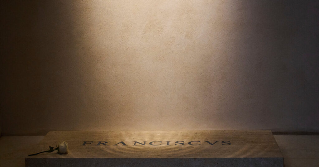
The arrangements for the funeral of Pope Francis were meticulous, and the ceremony drew a global audience. But it is the arrangement of the letters on his tombstone that are now attracting outsize attention.
The simple slab has only 10 letters, but the spacing between them can make it read like “F R A NCISC VS.”
Of course, the lettering is meant to be read as Franciscus, the derivative of the pope’s name in Latin. (V stood for both u and v in Latin.)
Pope Francis’s marble tomb reflects his simple style and fulfills his desire for an unadorned final resting place. In that sense, the tombstone lettering in Times Roman, a workmanlike font that is widely used in the English language, could be considered appropriate.
But for those who obsess about kerning, the space between letters, the view from above the tomb is not exactly an aesthetically pleasing one.
“Woe be unto the person who decided to do it the way that they did it, just because it’s a bad decision that will last for a long time, unless they change it,” said Charles Nix, the senior executive creative director at Monotype, one of the world’s largest typeface and technology companies.
In typography, Mr. Nix said, there is general spacing, which is the overall space between letters within a typeface. Kerning, though, is the space between letters or characters.
He said that, in addition to designing the actual letter, typographers design the space around each letter.
“We spend a lot of time, especially late in the design process, making sure that we have harmonious spacing,” Mr. Nix said.
“But even after getting the spacing as good as it can possibly be, you still end up with pairs of letters, like a capital A and a capital T, that end up having a lot of space between them,” he added. “So we create special kerning pairs and program them into the typeface.”
The double take for some when they look at the letters on the tombstone is caused by the lack of kerning between pairs of letters.
So what happened at the Vatican?
“It may have been laid out as individual letters, and not actually typed,” Mr. Nix said. “So it may not have been a font that created the template for it. It may have been that individual letters were put on whatever pattern was used, and they were spaced mathematically as opposed to visually.”
For centuries, people have tried to figure out a mathematical way to engrave letters, he said, and it always fails.
A representative of the Vatican could not immediately be reached for comment about the lettering.
A lack of kerning is common on grave markers, Mr. Nix said, especially those from the 20th century onward because they are produced very mathematically. That method is far less costly and can accommodate much more text, he said.
An editor at Fast Company, a magazine about business, technology and design, was among the first to notice the discordance.
Other more casual observers immediately pointed to the “A” in Franciscus standing apart from the other letters.
“Why does it look like pressing on the letter ‘A’ will open a secret chamber where the ark of the covenant is stored?” asked Elle Cordova, a digital creator, comedy writer and grammarian.
“It looks like they downloaded a bootlegged version of Times Roman without any kerning data embedded in the file, brought it into some ancient software, like Adobe Scribe 1517 A.D., and then let the software space the letters,” she said. “And this is what you get: an abomination unto design.”
Paul Shaw, a type and design historian, was equally disappointed, saying that the poor spacing was predictable because “RAN” and “CVS” have letters (RA and V) that historically have needed adjustment by hand.
“Pope Francis’s name was just cranked out by someone operating a stonecutting machine, probably via sandblasting from a template prepared on a computer,” he said.
“It is depressing, but not surprising,” he added. “Someone should have been hired to carve the name by hand.”


